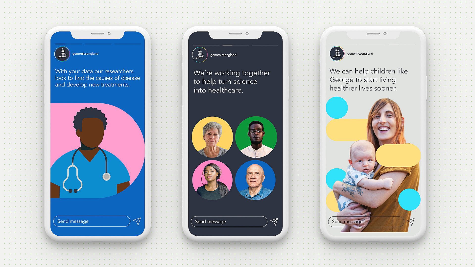
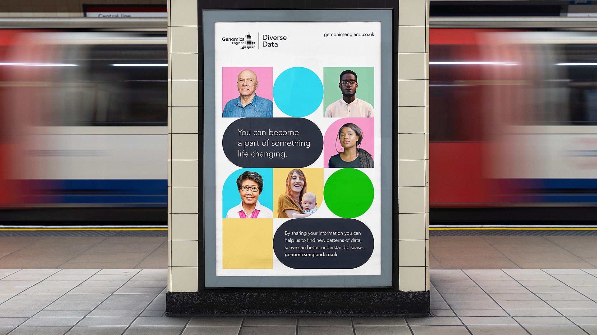
Redefining a brand for a new era

Client:
Genomics England

Background

Genomics England plays a critical role in making genomic healthcare and research possible, accessible, and impactful in the UK.

Originally established to deliver the ground-breaking 100,000 Genomes Project, the scope and influence of the organisation has evolved greatly since.


Problem

Due to the fame of its founding project amongst the research community, the Genomics England brand is well-known. However, that same community’s understanding of Genomics England’s capabilities was stuck in that project, and had not kept pace with its new range of activities.

And with this new range of activities, the organisation was having to engage more directly with a much wider variety of audiences, including patients in more challenging situations.

Genomics England’s brand identity did not have sufficient depth or variety to support this range of activities and audiences. In trying to overcome these limitations, different programmes had started to move beyond the core identity, leading to a lack of cohesion and attribution which threatened to undermine the organisation’s aims and credibility.


GEL Case Study 1
GEL Case Study 2
GEL Case Study 3

Insight

Whilst it was clear that the existing visual identity could be evolved and made more flexible to accommodate this breadth of activities and audiences, the most critical factor for success would be enabling all programmes to express their agenda and to have meaningful input in defining the solution.

Creating the space for each party to be heard and to listen and understand the argument of other advocates ensured that the rationale for the final decision could be respected, even if it was not what they had advocated for themselves.

Solution

Following exploration of potential brand architectures, the existing visual identity was evolved to allow greater variety and tone for different situations. Whilst still remaining as one brand.

The abstract shapes featured in the existing logo were used as the foundation for a full graphic system. Combined with a wider, softer colour palette and range of visual assets, this system is used to create communications which are more relevant and responsive to their context – whether it be for researchers, for parents of newborn children, or for communities who are under-represented in, and cautious of, such research.

GEL Case Study 4
GEL Case Study 5
GEL Case Study 6
GEL Case Study 7
Event banner for the Genomics England Diverse Data programme
Staff lanyard design for Genomics England
“We worked with True North to consolidate our branding and take it to the next level. I’m delighted we chose True North who owned the process from start to finish and overcame our internal differences to deliver a fantastic brand identity system that will propel Genomics England for years to come. It was an absolute pleasure working with their team.”
Michael Motskin, Marketing and Brand Director, Genomics England