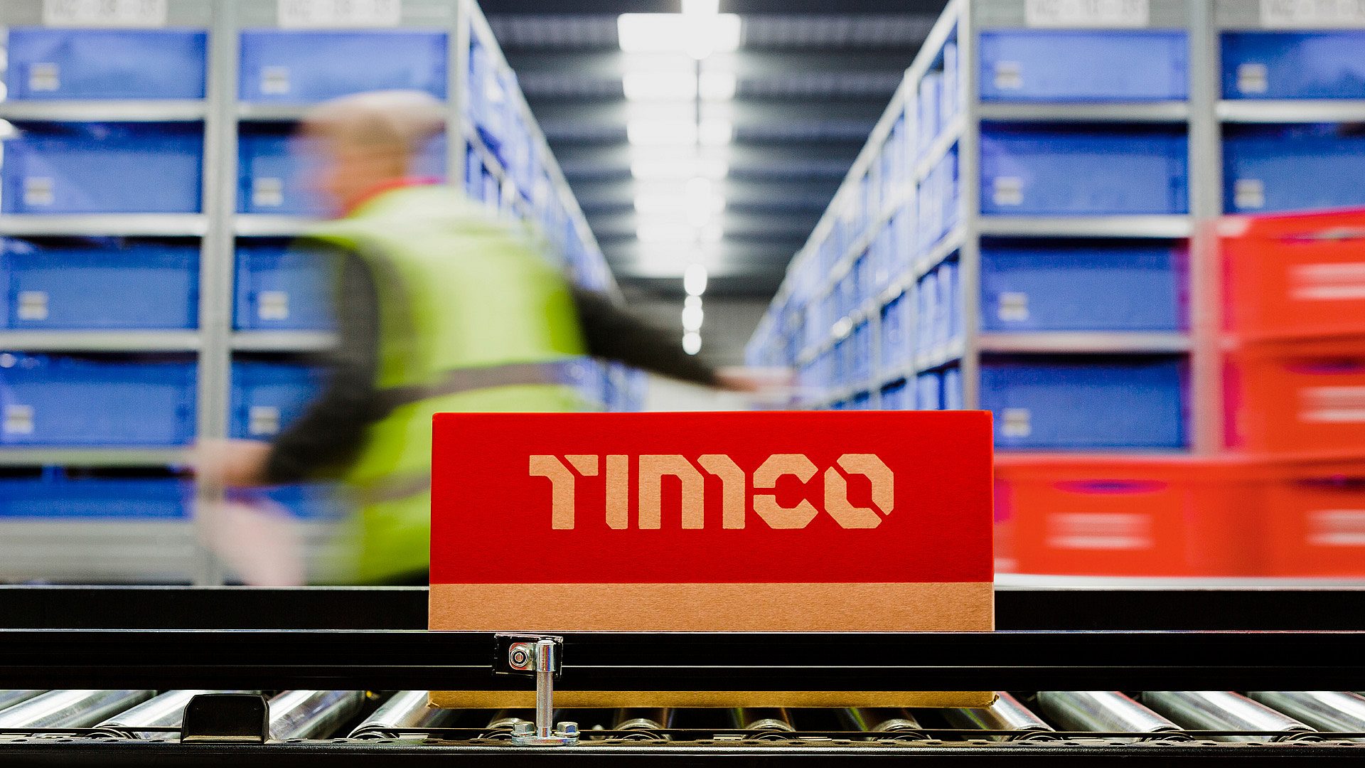
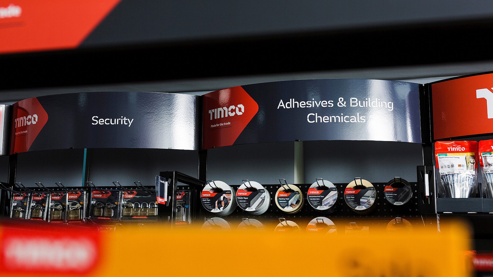
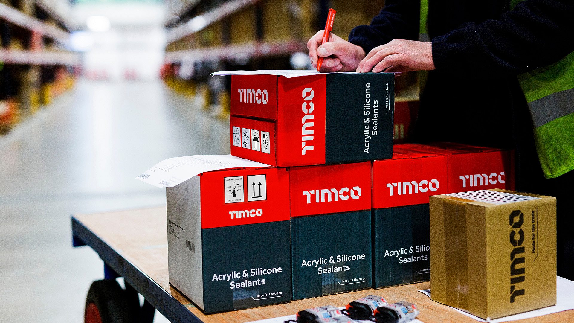
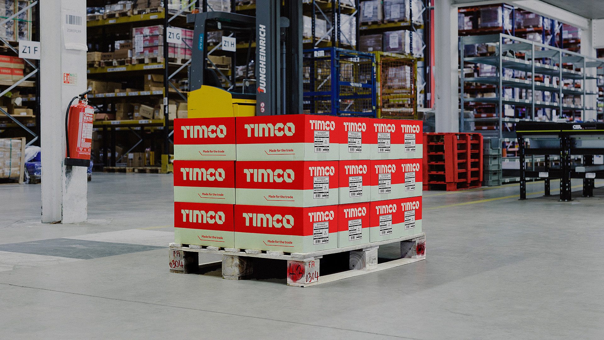
Making a brand portfolio more powerful

Timco Marque
Client:
TIMCO

Background

T I Midwood & Co is a manufacturer and wholesale distributor of trade products to independent retailers in UK. A family run business, they began with screws and fixings under the TIMco brand and regularly win supplier of the year in the industry’s awards.

In recent years they’d grown exponentially by introducing more and more product categories, everything from masking tapes to hand tools, under a range sub-brands. But their retail customers were feeling the effects of increased competition from Screwfix.

True North were briefed with refreshing the core and sub-brands to protect premium price points.

Timco Brand Architecture
TN Website TIMCO QUOTE

Problem

Each product category was already dominated by one or two well-established competitor brands. It was clear that the range of sub-brands was unsustainable without spending significantly more on marketing in each category. By engaging with TIMco’s retail customers, we found the proliferation of weaker sub-brands was starting to undermine their faith in the core range.

So we conducted research with professional tradespeople to identify where the opportunity for TIMco and their retail customers would be. Critically, we were able to prove that using TIMco branding in all categories improved the perceived quality of those products by between 10%-18% versus using the sub-brands.

With this, we were able to convince the business to change their approach. Investing in a simpler, monolithic brand approach would be far more effective for them and their customers, than continuing to support different brands in each category.

Insight

Good tradespeople know that spending a bit more on a trustworthy product saves them money and headaches in the long-run. It’s not just true for big ticket items like power tools, it’s true for the less considered, everyday items like nails, tapes and coverings. If you can’t rely on them to perform every time, you can’t enjoy the job. Yet no brand focusses on the importance of these details.

Tim Co Boxes on Palette Warehouse 1920x1280
Timco Guidelines
Made for the Trade Box 1920

Solution

The main brand would now stand for the essential products that good trade professionals rely on every day.

We simplified and emboldened the identity to deliver confidence across all categories – fulfilling the new promise of being ‘Made for the Trade’.

The rebrand updated the name to TIMCO, set in a stencil typeface built from modular components that can animate in application. Collaborating with G-Type Foundry, we created a bespoke display font for use on packaging, merchandising and marketing.

Building on TIMCO's 'toolbox red' as the signature brand colour, we developed a complementary grey and white palette for the range, and retained a handful of highlight colours that built upon the legacy branding of key products.

The new positioning influences every part of the business – from product development and sourcing, to POS, to ensuring that customer service and support is tailored to the changing needs of retail in this market.

Timco Tim Typeface1
Tim Co Boxes of Sealant x2
Tim Co Building Sign x2
Tim Co Product Screws drill bits 1920x1280
Timco Banners
“TIMCO has always been about great service and great products, quality everyday essentials that are made for the trade. Despite our initial brief to True North, they demonstrated that whilst the TIMCO name was highly-prized by our customers, many of our sub-brands weren’t as well known. It’s refreshing to work with an astute team who understand audiences, trust and the power of brands.”
Managing Director, Simon Midwood, TIMCO
Tim Co Box on Conveyor 1920x1280
Timco Catalogue
Tim Co Drill Bit Boxes 1920x1280
Tim Co Boxes on Palette Forklift 1920x1280
Timco Clothing
Tim Co Person Packing Boxes x2
Tim Co Product on Shelf 1920x1280